Split Axis Plotter
Introduction
We use the “Crime” dataset from pydataset to demonstrate the use of a split axis plotter (which allows breaks in the axes). This dataset contains information on crime rates for various counties in North Carolina over the 1981 to 1987 period. We will plot how the rates change with time for i) the three counties with the highest crime rate in 1987, and ii) the three counties with the lowest crime rate in 1987. This will lead to a plot with significant whitespace along the y-axis, making it a reasonable candidate for using an axis-break for.
Processing Data
We want to i) find which counties have the top/bottom crime rates in 1987, and ii) extract year vs crime rate for the top/bottom three. We also want to convert crime rate from per person to per 100 people, since this leads to rounder numbers. The code to carry out these transformations is shown below
Plotting Data
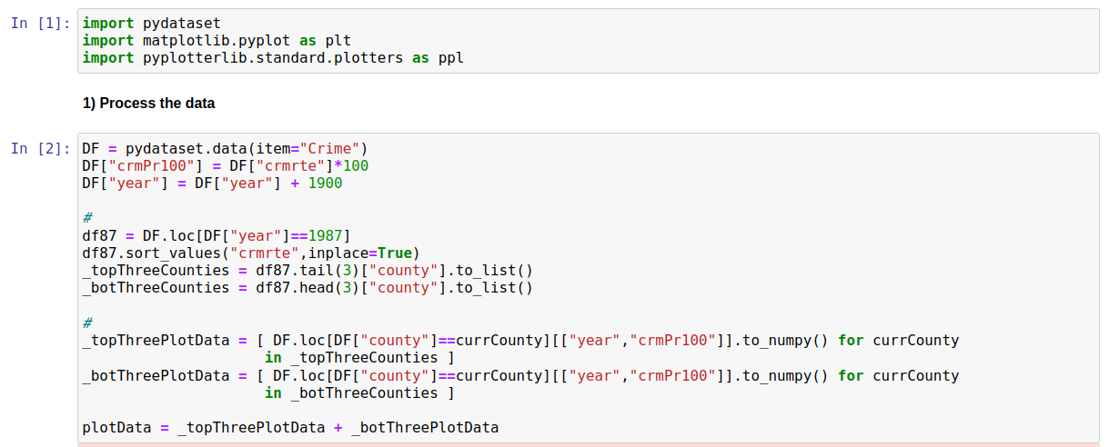
We start by creating a simple line plot for our data
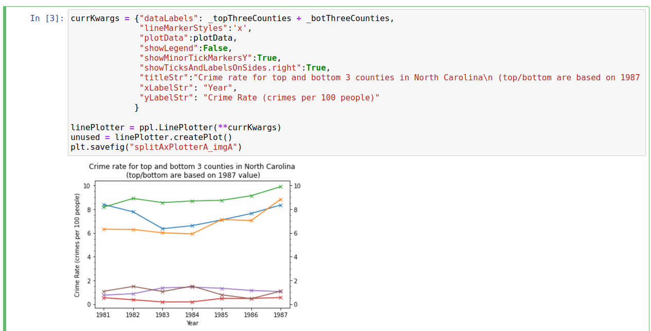
While this does a reasonable job of showing the trends, there is a lot of blank white-space along the y-axis and, as a result, it is difficult to read-off crime rates with any degree of precision (minor y-tick markers are every 0.5). We can solve this relatively easily using the “SplitAxisPlotterCreator”; in this case we simply need to pass in the plotter and the y-limits we want for each section, as shown below
It is now easier to see the value of each data point with greater precision (minor y-tick markers are now every 0.25) without using any more space or losing any information.
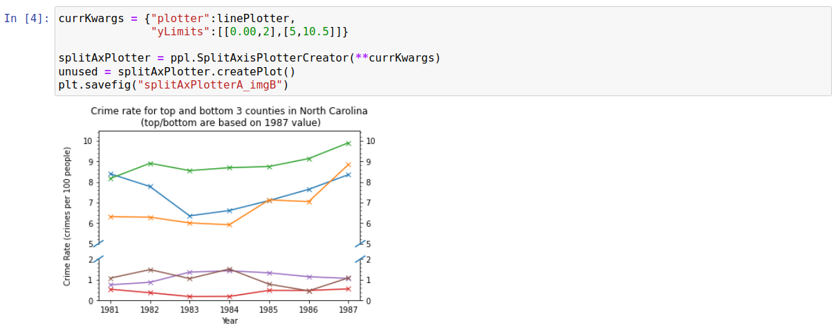
While this plot looks fine as it is, it is worth looking at some other settings for split/broken axes. Firstly, we demonstrate below that multiple axis splits can be carried out easily. We also move the x/y labels closer to the axes; this may need doing fairly commonly when using the SplitAxisPlotterCreator (though it wasn’t really neccesary in this case, and was done more for demonstration reasons).
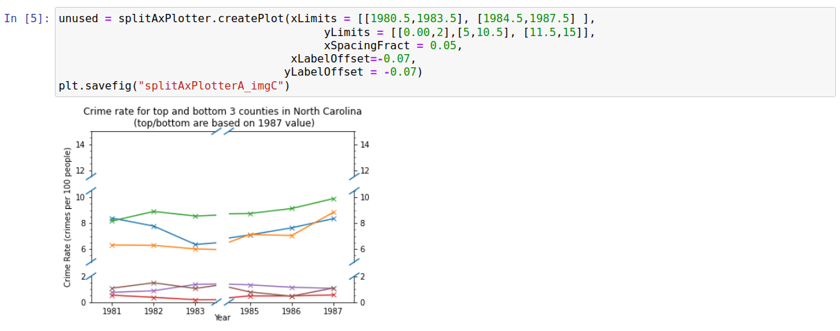
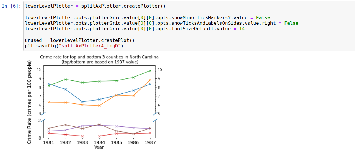
The “SplitAxisPlotterCreator” class used above actually creates a lower level plotter (“SplitAxisPlotter”) as an intermediate when creating plots. This lower level plotter holds a grid of plotters with dimensions (xSplits+1)*(ySplits+1), where xSplits and ySplits are the number of times the x/y axis have been split/broken respectively. There should be no need to ever interact with this lower-level, more unwieldly, plotter but it provides greater control over the plot than “SplitAxisPlotterCreator”; the most likely use case is probably to circumvent any bugs which may pop up in “SplitAxisPlotterCreator”. Purely for demonstration reasons, the below shows a case where we have specifically overwritten options for the bottom half of the axis.
Raw Code
The code to generate these above images is shown below:
import pydataset
import matplotlib.pyplot as plt
import pyplotterlib.standard.plotters as ppl

DF = pydataset.data(item="Crime")
DF["crmPr100"] = DF["crmrte"]*100
DF["year"] = DF["year"] + 1900

df87 = DF.loc[DF["year"]==1987]
df87.sort_values("crmrte",inplace=True)
_topThreeCounties = df87.tail(3)["county"].to_list()
_botThreeCounties = df87.head(3)["county"].to_list()

_topThreePlotData = [ DF.loc[DF["county"]==currCounty][["year","crmPr100"]].to_numpy() for currCounty
                     in _topThreeCounties ]
_botThreePlotData = [ DF.loc[DF["county"]==currCounty][["year","crmPr100"]].to_numpy() for currCounty
                     in _botThreeCounties ]

plotData = _topThreePlotData + _botThreePlotData


currKwargs = {"dataLabels": _topThreeCounties + _botThreeCounties,
              "lineMarkerStyles":'x',
              "plotData":plotData,
              "showLegend":False,
              "showMinorTickMarkersY":True,
              "showTicksAndLabelsOnSides.right":True,
              "titleStr":"Crime rate for top and bottom 3 counties in North Carolina\n (top/bottom are based on 1987 value)",
              "xLabelStr": "Year",
              "yLabelStr": "Crime Rate (crimes per 100 people)"
             }

linePlotter = ppl.LinePlotter(**currKwargs)
unused = linePlotter.createPlot()
plt.savefig("splitAxPlotterA_imgA")

currKwargs = {"plotter":linePlotter,
              "yLimits":[[0.00,2],[5,10.5]]}

splitAxPlotter = ppl.SplitAxisPlotterCreator(**currKwargs)
unused = splitAxPlotter.createPlot()
plt.savefig("splitAxPlotterA_imgB")

unused = splitAxPlotter.createPlot(xLimits = [[1980.5,1983.5], [1984.5,1987.5] ],
                                        yLimits = [[0.00,2],[5,10.5], [11.5,15]],
                                        xSpacingFract = 0.05,
                                   xLabelOffset=-0.07,
                                  yLabelOffset = -0.07)
plt.savefig("splitAxPlotterA_imgC")

lowerLevelPlotter = splitAxPlotter.createPlotter()

lowerLevelPlotter.opts.plotterGrid.value[0][0].opts.showMinorTickMarkersY.value = False
lowerLevelPlotter.opts.plotterGrid.value[0][0].opts.showTicksAndLabelsOnSides.value.right = False
lowerLevelPlotter.opts.plotterGrid.value[0][0].opts.fontSizeDefault.value = 14

unused = lowerLevelPlotter.createPlot()
plt.savefig("splitAxPlotterA_imgD")